Form Primitives are used to compose form fields.
Form::Labelis the label associated with the form controlForm::HelperTextis an optional text used to help understand what the field is intended forForm::Erroris the error message shown in case of failed validation of the fieldForm::Indicatoris the indicator for "Required" or "Optional" inputsForm::Legendis the legend associated to the fieldsetForm::Fieldis the generic container for control, label, helper text and error messagingForm::Fieldsetis the generic container to group multiple fields with label, helper text, and error messagingForm::CharacterCountis optionally used to display the number of characters entered in a field, the maximum or minimum number of characters allowed, or a custom message communicating the relationship between the count and the maximum or minimum length.CharacterCountis only used in fields that accept text values (TextInput, Textarea, MaskedInput).
We use Form Primitives as the building blocks for the “field” and “group” controls. While we recommend using our pre-defined “field” and “group” controls because they provide built-in accessibility support, you can use the Form Primitives to implement custom layouts or controls as necessary.
Content
Form::Label
- We recommend keeping labels clear and concise, about 1-3 words. They should not consist of full sentences.
- 3.2.2 Labels or Instructions (A): Labels or instructions are provided when content requires user input.
Form::HelperText
- Use helper text to give the user extra details about the data you’re asking them to input, e.g., formatting requirements such as MM-DD-YYYY.
Form::CharacterCount
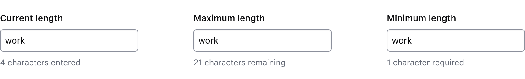
Use a character count to communicate the current length of the value in an input and whether it meets or exceeds the length requirements passed to the component. The component accepts multiple arguments to set length requirements and exposes several computed values to support custom messages. Visit the code documentation for more details.
Default messages
Depending on which property (or properties) are passed to the component, a different default message will be displayed by the component to communicate the relationship between the current length of the input value (currentLength) and the maximum length (maxLength), minimum length (minLength), or both.
Test and interact with the default messaging examples in the code documentation.
The default messages provide a consistent messaging pattern for the component by clearly communicating length requirements to the user while displaying their progress towards meeting the requirements.
Usage in Figma
For representative consistency, the Figma component mirrors the default messages that are rendered in the Ember component and are labelled as such; currentLength (the default variant), maxLength, minLength, and custom.
In all variants except the custom variant, we recommend only overriding the numerical value (e.g., "{numerical value} characters is allowed"). Overriding the text in these variants will require a custom implementation on the engineering side, instead, the custom variant should be used.
Custom messages
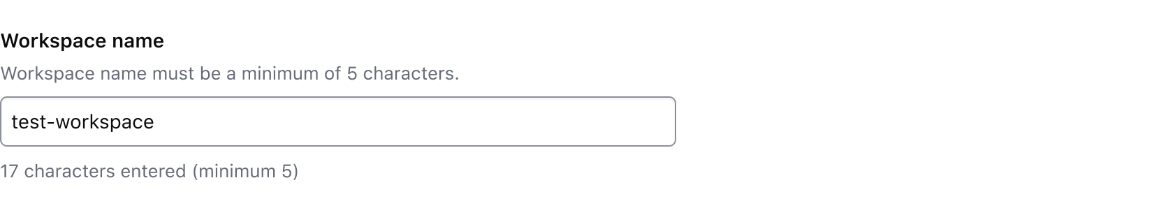
A custom message in the character count is supported and can be used when a product or application-specific message or term is required, e.g., "registry" or "workspace".
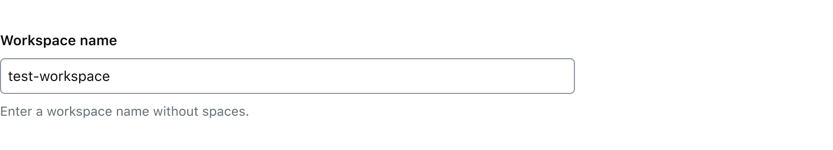
Avoid presenting duplicate information between the helper text and the character count. Helper text should be used to provide persistent requirements while character count represents more of a progress indicator towards a length requirement.
Don’t use the character count to display static details about the field. Use helper text to provide extra details about the information being requested and the character count to communicate the user’s progress toward meeting the requirements.
Form::Error
- Error messages should provide the user with enough context to guide them in resolving the error.
- Keep labels and legends short and to the point (ie. "Select one option")
- Avoid overt politeness; don’t use "please" or "thank you" in your messaging.
- 3.3.1 Error Identification: If an input error is automatically detected, the item that is in error is identified and the error is described to the user in text.
- 3.3.3 Error Suggestion (AA): If an input error is automatically detected and suggestions for correction are known, then the suggestions are provided to the user, unless it would jeopardize the security or purpose of the content.
- 3.3.4 Error Prevention (Legal, Financial, Data) (AA): For Web pages that cause legal commitments or financial transactions for the user to occur, that modify or delete user-controllable data in data storage systems, or that submit user test responses, at least one of the following is true: submissions are reversible, data is checked and the user is provided an opportunity to correct them, a mechanism is available for reviewing, confirming, and correcting the information before finalizing the submission.
- 4.1.3 Status Messages: In content implemented using markup languages, status messages can be programmatically determined through role or properties such that they can be presented to the user by assistive technologies without receiving focus.
How to use this component
Form::Label
The default invocation requires text to be passed and a controlId argument (the ID of the form control associated with the label).
<Hds::Form::Label @controlId="control-ID">
  My label
</Hds::Form::Label>
Pass an isRequired argument, when user input is required for the associated form control.
<Hds::Form::Label @controlId="control-ID" @isRequired={{true}}>
  My label
</Hds::Form::Label>
Pass an isOptional argument, when the user input is optional for the associated form control.
<Hds::Form::Label @controlId="control-ID" @isOptional={{true}}>
 My label
</Hds::Form::Label>
If the label needs to contain more than just text, it’s possible to pass structured content to component. While the correct text styling is applied to the component’s container, the layout of the content inside the component is the responsibility of the product team.
<Hds::Form::Label @controlId="control-ID">
  <span>Some text</span>
  <Hds::Badge @size="small" @text="Some badge" @color="highlight" />
</Hds::Form::Label>
Form::HelperText
The default invocation requires text to be passed and a controlId argument.
The controlId value is used to generate an ID, prefixed with helper-text-, so that the ID can be referenced in the aria-describedby attribute of the form control. If no controlId is provided, no ID is generated. If needed, it can be passed directly as an HTML attribute.
<Hds::Form::HelperText @controlId="helper-text-first">
  This is some helper text
</Hds::Form::HelperText>
If the helper text needs to contain more than just text, use the block form of the component. While the correct styling is applied to the component itself, the nested components may need additional styling and are the responsibility of the product team.
some formatted code
or a strong message.
<Hds::Form::HelperText @controlId="control-ID">
  Some text with a
  <Hds::Link::Inline @route="show" @model="components/link/inline">
  Hds::Link::Inline</Hds::Link::Inline>,
  or <code>some formatted code</code>
  or a <strong>strong message</strong>.
</Hds::Form::HelperText>
Form::CharacterCount
The default invocation requires a controlId argument referencing a valid <input> or <textarea> element and a @value argument storing the value of the associated form control.
The controlId value is used to generate an ID, prefixed with character-count-, so that the ID can be referenced in the aria-describedby attribute of the form control.
<input type="text" aria-label="input with default character count" id="input-character-count-default" value={{this.value1}} {{on "input" (fn this.updateValue "value1")}}/>
<Hds::Form::CharacterCount @controlId="input-character-count-default" @value={{this.value1}}/>
If the user input needs to be limited to a certain number of characters, use @maxLength to guide the user in meeting the length requirements. This property does not restrict the users from entering characters over the limit. To define the maximum string length that the user can enter, set maxlength attribute on the associated input field.
<input type="text" aria-label="input with max length count" id="input-character-count-max" value={{this.value2}} {{on "input" (fn this.updateValue "value2")}}/>
<Hds::Form::CharacterCount @maxLength={{10}} @controlId="input-character-count-max" @value={{this.value2}}/>
If the user input is required to have a certain number of characters, use @minLength to guide the user in meeting the length requirements.
<input type="text" aria-label="input with min length count" id="input-character-count-min" value={{this.value3}} {{on "input" (fn this.updateValue "value3")}}/>
<Hds::Form::CharacterCount @minLength={{3}} @controlId="input-character-count-min" @value={{this.value3}}/>
When the user input needs to be in a certain range, use both @minLength and @maxLength to guide the user in meeting the length requirements.
<input type="text" aria-label="input with min and max length count" id="input-character-count-min-max" value={{this.value4}} {{on "input" (fn this.updateValue "value4")}}/>
<Hds::Form::CharacterCount @minLength={{3}} @maxLength={{10}} @controlId="input-character-count-min-max" @value={{this.value4}}/>
Custom message
For custom messages, you can use the following arguments to build a relevant message: currentLength (the current number of characters in the associated form control), maxLength (the maximum number of characters allowed in the associated form control), minLength (the minimum number of characters required in the associated form control), remaining (the difference between maxLength and currentLength), and shortfall (the difference between currentLength and minLength).
<input type="text" aria-label="input with min and max length count" id="input-character-count-custom" value={{this.value5}} {{on "input" (fn this.updateValue "value5")}}/>
<Hds::Form::CharacterCount @maxLength={{20}} @controlId="input-character-count-custom" @value={{this.value5}} as |CC|>
  {{CC.remaining}} characters remaining
</Hds::Form::CharacterCount>
Form::Error
The default invocation requires text to be passed and a controlId argument.
The controlId value will be used to generate an ID, prefixed with error-, so that this ID can be referenced in the aria-describedby attribute of the form control. If no controlId is provided, no ID is generated. If needed, it can be passed directly as an HTML attribute.
<Hds::Form::Error @controlId="error-message-first">This is a simple error message</Hds::Form::Error>
If the error is made up of multiple messages, it’s possible to iterate over a collection of error messages.
<Hds::Form::Error @controlId="control-ID" as |Error|>
  {{#each this.SAMPLE_ERROR_MESSAGES as |message|}}
    <Error.Message>{{message}}</Error.Message>
  {{/each}}
</Hds::Form::Error>
Form::Indicator
If no isRequired/isOptional argument is provided, the component will not render anything.
Required
Pass an isRequired argument, to render a Required Indicator.
<Hds::Form::Indicator @isRequired={{true}} />
Optional
Pass an isOptional argument, to render an Optional Indicator.
<Hds::Form::Indicator @isOptional={{true}} />
Form::Legend
The default invocation requires text to be passed.
<Hds::Form::Legend>My legend</Hds::Form::Legend>
Required
Pass an isRequired argument, when user input is required for the associated form control.
<Hds::Form::Legend @isRequired={{true}}>My legend</Hds::Form::Legend>
Optional
Pass an isOptional argument, when user input is optional for the associated form control.
<Hds::Form::Legend @isOptional={{true}}>My legend</Hds::Form::Legend>
Structured content
If the legend needs to contain more than just text, it’s possible to pass structured content to component. While the correct text styling is applied to the component’s container, the layout of the content inside the component is the responsibility of the product team.
<Hds::Form::Legend>
  <span>Some text</span>
  <Hds::Badge @size="small" @text="Some badge" @color="highlight" />
</Hds::Form::Legend>
Form::Field
The default invocation includes a set of contextual components, a control (in this case a text input) with hashed values passed back to it, and a @layout argument. Depending on the context, you may want to pass just the label, or the label and the helper text, while the error message is likely conditional to the validation of the input provided by the user. The arguments id and ariaDescribedBy are automatically generated by the component and passed back to the control.
The layout of the content inside the "control" container is the responsibility of the product team.
<Hds::Form::Field @layout="vertical" @isRequired={{true}} as |F|>
  <F.Label>This is the label</F.Label>
  <F.HelperText>This is the helper text</F.HelperText>
  <F.Control>
    <!--add your control here-->
    <input
      type="email"
      id={{F.id}}
      value="jane.doe@email.com"
      class="my-custom-class"
      aria-describedby={{F.ariaDescribedBy}}
    />
  </F.Control>
  <F.Error>This is the error</F.Error>
</Hds::Form::Field>
Form::Fieldset
The default invocation includes a set of contextual components, one or more fields (in this case radio buttons within a label), and a @layout argument. Depending on the context, you may want to pass just the legend, just the helper text, both or none, while the error message is likely conditional to the validation of the inputs provided by the user.
The layout of the content inside the "control" container is the responsibility of the product team.
<Hds::Form::Fieldset @layout="horizontal" @isRequired={{true}} as |F|>
  <F.Legend>This is the legend</F.Legend>
  <F.HelperText>This is the helper text</F.HelperText>
  <!-- add your fields here -->
  <F.Control>
    <label for="my-group-checkbox1" class="my-custom-class">
      <input type="checkbox" id="my-group-checkbox1" checked="checked" />
      selection #1
    </label>
  </F.Control>
  <F.Control>
    <label for="my-group-checkbox2" class="my-custom-class">
      <input type="checkbox" id="my-group-checkbox2" />
      selection #2
    </label>
  </F.Control>
  <F.Error>This is the error</F.Error>
</Hds::Form::Fieldset>
Component API
Form::Label
controlId
string
for attribute of the <label> element.
isRequired
boolean
- false (default)
Required indicator next to the label text when user input is required.
isOptional
boolean
- false (default)
Optional indicator next to the label text when user input is optional.
yield
<label> HTML element.
…attributes
...attributes.
Form::HelperText
controlId
string
id HTML attribute (with a helper-text- prefix). This HelperText ID can then be referenced in the aria-describedby attribute of the form control.
yield
…attributes
...attributes.
Form::CharacterCount
controlId
string
id HTML attribute (with a character-count- prefix). This CharacterCount ID can then be referenced in the aria-describedby attribute of the form control.
value
string
maxLength and minLength, respectively.
maxLength
number
maxlength attribute on the associated input field.
minLength
number
yield
currentLength (the current number of characters in the associated form control), maxLength (the maximum number of characters allowed in the associated form control), minLength (the minimum number of characters required in the associated form control), remaining (the difference between maxLength and currentLength), and shortfall (the difference between currentLength and minLength).
…attributes
...attributes.
Form::Error
controlId
string
id HTML attribute (with an error- prefix). This Error ID can then be referenced in the aria-describedby attribute of the form control.
yield
…attributes
...attributes.
Form::Indicator
isRequired
boolean
- false (default)
Required indicator.
isOptional
boolean
- false (default)
Optional indicator.
Form::Legend
isRequired
boolean
- false (default)
Required indicator next to the label text when user input is required.
isOptional
boolean
- false (default)
Optional indicator next to the label text when user input is optional.
yield
<legend> HTML element.
…attributes
...attributes.
Form::Field
layout
enum
- vertical
- flag
TextInput, Textarea and Select fields. “Flag” layout is used for Checkbox, Radio and Toggle fields.
id
string
By default the ID is automatically generated by the component; use this argument if you need to pass a custom ID for specific reasons you may have.
extraAriaDescribedBy
string
aria-describedby HTML attribute.
By default the
aria-describedby attribute is automatically generated by the component, using the IDs of the helper text and errors (if they’re present); use this argument if you need to pass extra IDs for specific reasons you may have.
isRequired
boolean
- false (default)
Required indicator next to the label text when user input is required.
isOptional
boolean
- false (default)
Optional indicator next to the label text when user input is optional.
…attributes
...attributes.
Contextual components
Control, label, helper text, and error content are passed to the field as yielded components, using the Label, HelperText, Control, CharacterCount, and Error keys.
<[F].Label>
yielded component
<label> element. The content can be a simple string, or a more complex/structured one (in which case it inherits the text style). For details about its API check the Form::Label component.
The
for attribute of the label is automatically generated.
<[F].HelperText>
yielded component
Form::HelperText component.
The
id attribute of the element is automatically generated.
<[F].Control>
yielded component
Control yielded component exposes two hashed arguments:
[C].id
string
id attribute for the control element (generated automatically, unless provided using the @id argument described above).
[C].ariaDescribedBy
string
aria-describedby attribute for the control element (generated automatically, based on the presence of the HelperText an/or the Error elements in the field, plus the optional @extraAriaDescribedBy argument described above).
<[F].CharacterCount>
yielded component
Form::CharacterCount component.
The
id attribute of the element is automatically generated.
<[F].Error>
yielded component
Form::Error component.
The
id attribute of the Error element is automatically generated.
<[E].Message>
yielded component
Error.Message.
Form::Fieldset
layout
enum
- vertical (default)
- horizontal
id
string
By default the ID is automatically generated by the component; use this argument if you need to pass a custom ID for specific reasons you may have.
isRequired
boolean
- false (default)
Required indicator next to the label text when user input is required.
isOptional
boolean
- false (default)
Optional indicator next to the label text when user input is optional.
…attributes
...attributes.
Contextual components
Control, Label, HelperText, and Error content are passed to the field as yielded components. The component also exposes two hashed methods, id and ariaDescribedBy.
<[F].Legend>
yielded component
<legend> element. The content can be a simple string, or a more complex/structured one (in which case it inherits the text style). For details about its API check the Form::Legend component.
<[F].HelperText>
yielded component
Form::HelperText component.
The
id attribute of the element is automatically generated.
<[F].Control>
yielded component
You can pass all the controls to a single
<Control> container, or you can have one control per container.
[C].id
function
id attribute for the control element (generated automatically, unless provided using the @id argument described above).
[C].ariaDescribedBy
function
aria-describedby attribute for the control element (generated automatically, based on the presence of the HelperText an/or the Error elements in the field, plus the optional @extraAriaDescribedBy argument described above).
<[F].Error>
yielded component
Form::Error component.
The
id attribute of the Error element is automatically generated.
<[E].Message>
yielded component
Error.Message.
Conformance rating
Form Primitives aren’t conformant until used in conjunction with the other components that will make them conformant.
Known issues
If a link is used within a label, helper text, or error text, it will not be presented as a link to the user with a screen reader; only the text content is read out. As such, care should be used when considering this feature.
Applicable WCAG Success Criteria
This section is for reference only, some descriptions have been truncated for brevity. This component intends to conform to the following WCAG Success Criteria:
-
1.3.1
Info and Relationships (Level A):
Information, structure, and relationships conveyed through presentation can be programmatically determined or are available in text. -
1.3.2
Meaningful Sequence (Level A):
When the sequence in which content is presented affects its meaning, a correct reading sequence can be programmatically determined. -
1.3.4
Orientation (Level AA):
Content does not restrict its view and operation to a single display orientation, such as portrait or landscape. -
1.4.1
Use of Color (Level A):
Color is not used as the only visual means of conveying information, indicating an action, prompting a response, or distinguishing a visual element. -
1.4.10
Reflow (Level AA):
Content can be presented without loss of information or functionality, and without requiring scrolling in two dimensions. -
1.4.11
Non-text Contrast (Level AA):
The visual presentation of the following have a contrast ratio of at least 3:1 against adjacent color(s): user interface components; graphical objects. -
1.4.12
Text Spacing (Level AA):
No loss of content or functionality occurs by setting all of the following and by changing no other style property: line height set to 1.5; spacing following paragraphs set to at least 2x the font size; letter-spacing set at least 0.12x of the font size, word spacing set to at least 0.16 times the font size. -
1.4.3
Minimum Contrast (Level AA):
The visual presentation of text and images of text has a contrast ratio of at least 4.5:1 -
1.4.4
Resize Text (Level AA):
Except for captions and images of text, text can be resized without assistive technology up to 200 percent without loss of content or functionality. -
2.4.6
Headings and Labels (Level AA):
Headings and labels describe topic or purpose. -
3.3.2
Labels or Instructions (Level A):
Labels or instructions are provided when content requires user input. -
4.1.2
Name, Role, Value (Level A):
For all user interface components, the name and role can be programmatically determined; states, properties, and values that can be set by the user can be programmatically set; and notification of changes to these items is available to user agents, including assistive technologies.
Support
If any accessibility issues have been found within this component, let us know by submitting an issue.
4.20.0
Form::Label - Forced the for HTML attribute to be converted to a string