Breakpoints are viewport widths where layouts adjust to support responsive experiences on varied screen sizes and devices. These values are used to create utilities and helper components that standardize changes in UI at these widths.
The ranges
There are five HDS breakpoint values: sm, md, lg, xl, and xxl.
| Name | Value | Application |
|---|---|---|
| sm | 480px | 480 → 767 |
| md | 768px | 768 → 1087 |
| lg | 1088px | 1088 → 1439 |
| xl | 1440px | 1440 → 1919 |
| xxl | 1920px | 1920 and up |
The breakpoint name refers to a range of pixel values, not just the starting value. For example, the sm breakpoint refers to widths between 480px and 767px. This helps simplify the language around what these ranges mean when designing and increases the flexibility in implementation.
Note: the range 0-479px is intentionally left without a name. We don't anticipate designers needing to produce mockups for screen sizes below this width and from the audits conducted, Cloud UI has set a standard of 480px for the most narrow design. From a development perspective, in a mobile-first approach the range below 480px can be covered using default styles (overwritten via media queries for subsequent ranges).
Custom values
The provided breakpoints serve as a cohesive starting point for design, which is why templates have been provided in our Patterns library for this purpose. However, custom values may be necessary for specific use cases that these breakpoints do not cover. For example, if a team discovers that users with 2500px viewports are using a product, a nuanced approach to the UI at that screen size may be required. In such cases, a custom width value may be used to enhance the user experience.
Designing with purpose
Not all designs require redesigning at each breakpoint. Only when designs are considered complicated and/or constrained by UI elements should a designer take the time to show how they change as the viewport changes in size.
For example, a UI featuring a table layout may not require changes for each breakpoint because the expected behavior is for the table to maintain its full width regardless of the breakpoint value. A design isn't necessary to elaborate this standard behavior.
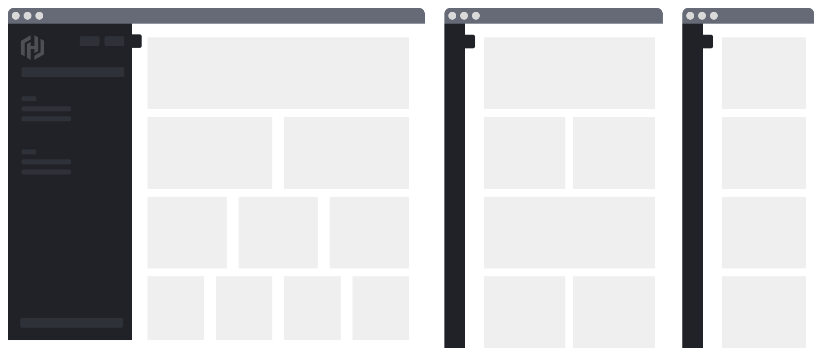
Redesigning across multiple breakpoints is often necessary for complex UIs, such as a landing page with cards arranged in a grid. As the viewport size decreases, both the position and content of the cards change, requiring nuanced designs across breakpoints. In such scenarios, designers should specify how the layout adjusts at the sm, md, and lg views.
Responsiveness in Helios
Responsive behavior is already built into some Helios components. These components include, but are not limited to:
- App Side Nav (width collapses below lg breakpoint)
- Stepper Nav (layout shifts below sm breakpoint)
- Pagination (layout stacks below lg breakpoint)
How to use the breakpoints
In responsive design it's common practice to define specific media queries in CSS that can be used to control not only the layout of the entire page and its parts, but also other aspects of a UI like typography, spacing, the rendering of decorative elements, the resolution of media assets, and much more. These media queries are built using CSS @media declarations in combination with a set of standard breakpoints.
Our design system defines breakpoint values based on browser viewport widths. The intervals between these breakpoints create distinct ranges, which can be used with the Sass and JavaScript helpers to implement responsive designs for our applications.
Sass
To use the Sass helpers provided by the design system, you must import the corresponding Sass file (via @use, as recommended) from the @hashicorp/design-system-components package:
// from @hashicorp/design-system-components package
@use "mixins/breakpoints" as *;
Once the file is imported, you will have access to the Sass helpers described below.
Mixins
Sass mixins offer the simplest, most efficient way to implement responsive layouts using the standard breakpoints defined in our system. We provide three different mixins:
hds-breakpoint-above($name)- for media queries that apply to a viewport range above a certain breakpoint (useful for a mobile-first approach)hds-breakpoint-below($name)- for media queries that apply to a viewport range below a certain breakpoint (useful for a desktop-first approach)hds-breakpoint-between($lower, $upper)- for media queries that apply to a viewport range between two breakpoints
Here is an example of how the mixins could be used in a mobile-first responsive layout:
// from @hashicorp/design-system-components package
@use "mixins/breakpoints" as *;

.my-responsive-layout {
  // this is the default behavior, that covers the range 0px–767px
  display: flex;
  direction: column;
  gap: 1rem;

  // at 768px the layout changes, from a vertical stack to an horizontal one
  @include hds-breakpoint-above('md') {
    direction: row;
  }

  // at larger viewports we increase the spacing between the items
  @include hds-breakpoint-above('xl') {
    gap: 2rem;
  }
}
The same layout could be achieved using a desktop-first approach in a similar way:
// from @hashicorp/design-system-components package
@use "mixins/breakpoints" as *;

.my-responsive-layout {
  // this is the default behavior
  display: flex;
  direction: row;
  gap: 2rem;

  // at smaller viewports we decrease the spacing between the items
  @include hds-breakpoint-below('xl') {
    gap: 1rem;
  }

  // at 768px the layout changes, from an horizontal stack to a vertical one
  @include hds-breakpoint-below('md') {
    direction: column;
  }
}
Of course, these are oversimplified examples. In your implementation, you will have to choose which mixin is best suited to achieve the desired responsive layout. This will depend on the design specifications, the context of the layout within the page, and how it relates with other UI elements.
Key/Value Map
For special use cases, we also provide a Sass map–$hds-breakpoints–which is a lower level helper than the mixins. Here's an example of how this map could be used:
// explicit import of `map` module (required by Sass)
@use "sass:map";
// from @hashicorp/design-system-components package
@use "mixins/breakpoints" as *;

@each $name, $size in $hds-breakpoints {
  .my-custom-breakpoint-class--#{$name} {
    // here you have access to the breakpoint name and its value (width in px)
  }
}
JavaScript
We also provide helpers in case you need to access the breakpoints names/values in JavaScript code.
You have access to the list of breakpoint names and values using the hdsBreakpoints map:
import { hdsBreakpoints } from '@hashicorp/design-system-components/utils/hds-breakpoints';

// do something with a specific breakpoint value
const myBreakpoint1 = hdsBreakpoints['xl'].value; // numeric (eg. 1440)
const myBreakpoint2 = hdsBreakpoints['lg'].px;    // size in px (eg. 1088px)
const myBreakpoint3 = hdsBreakpoints['sm'].rem;   // size in rem (eg. 30rem)

// loop over all the breakpoints
Object.entries(hdsBreakpoints).forEach(([name, sizes]) => {
  // do something with a specific breakpoint value in px
  const myBreakpointSizePx = sizes.px;
});